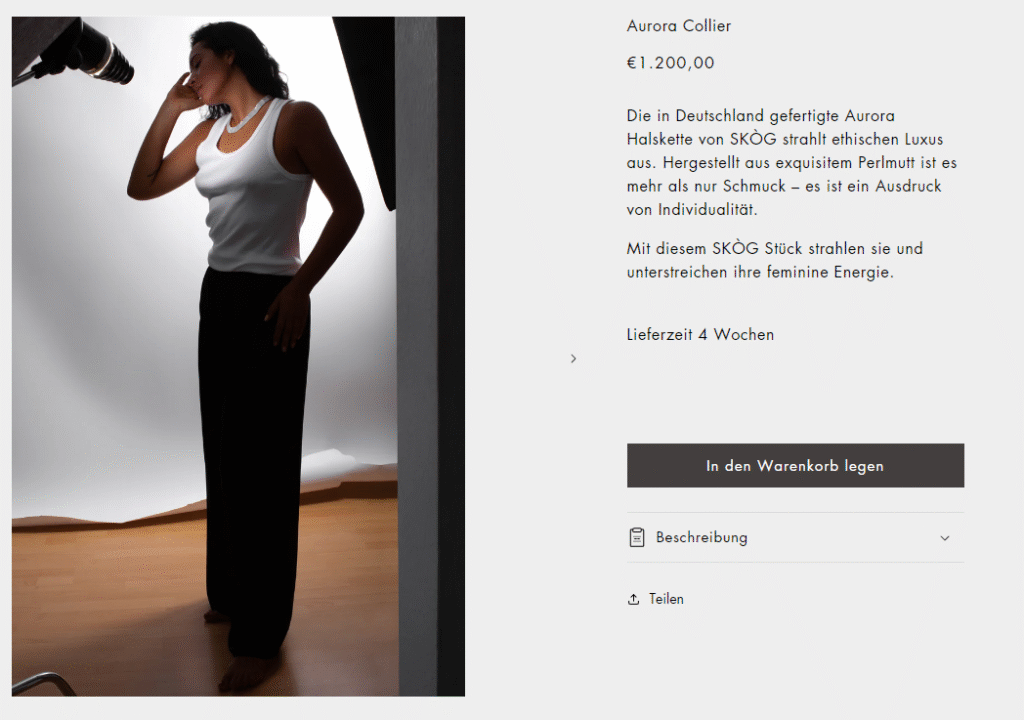
Luxury Wellness & Jewelry Brand – UX Strategy + Website Design + Visual Direction

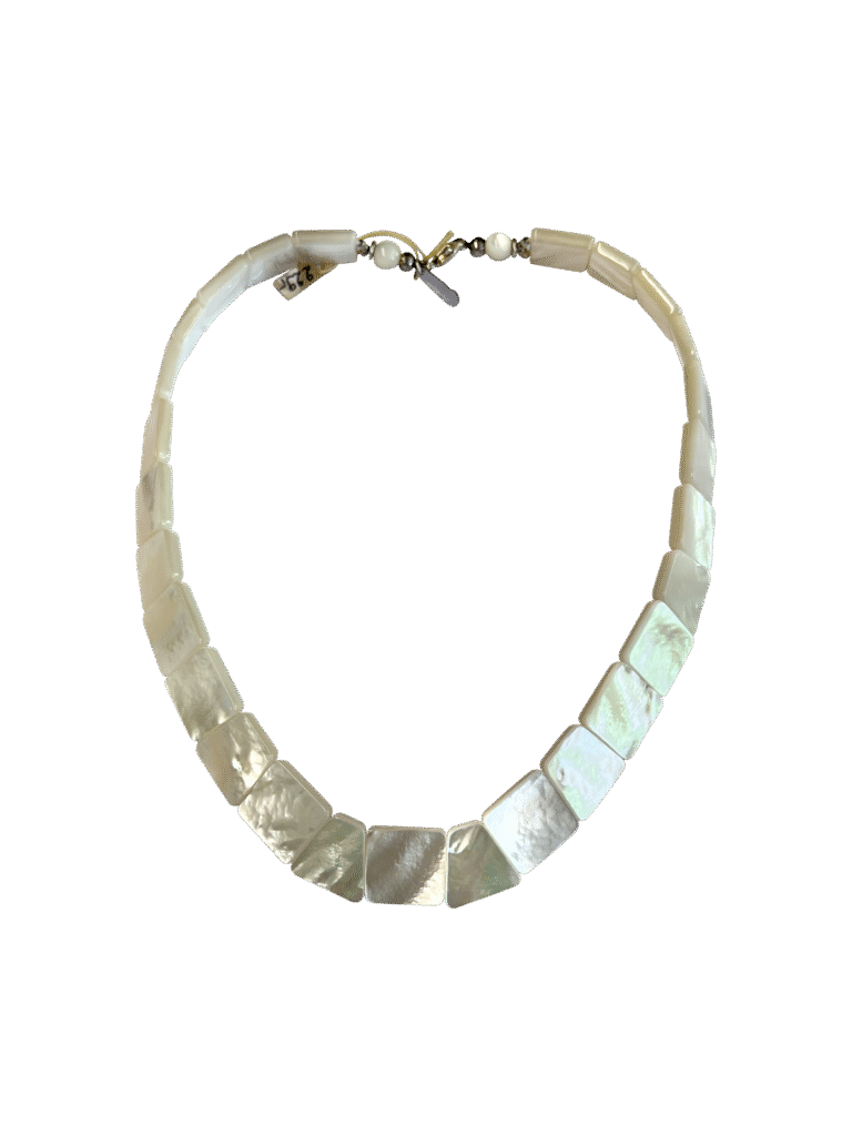
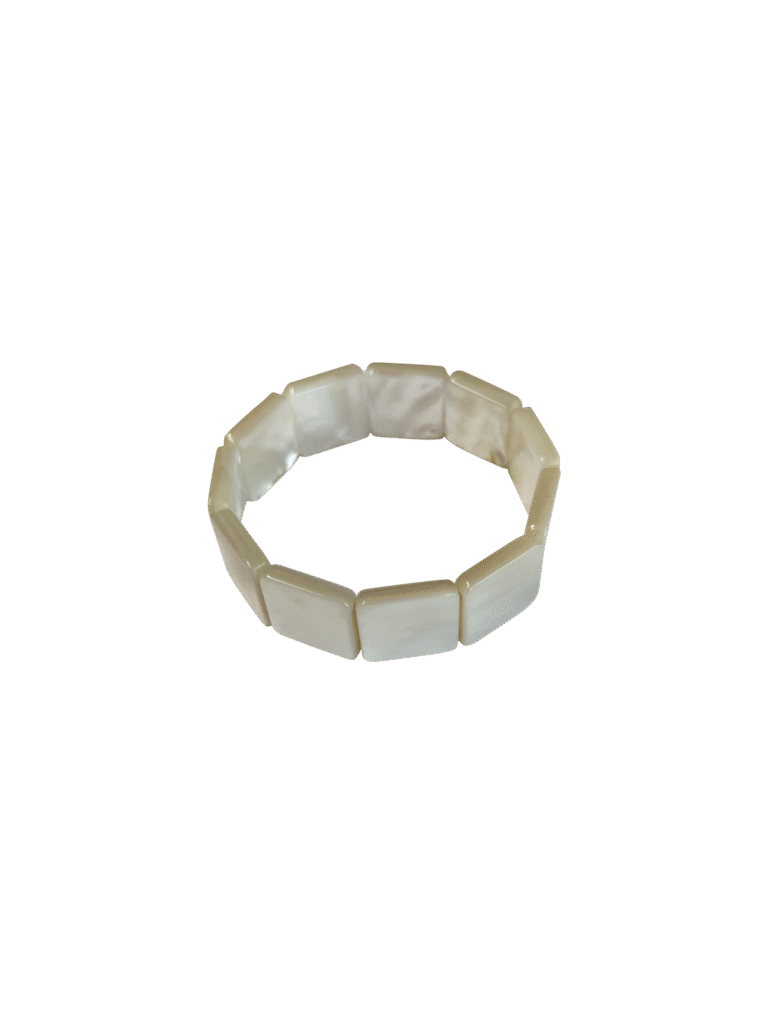
Skog is a luxury wellness and jewelry brand inspired by Scandinavian design values and natural materials. Their signature products — crafted from 15-year-aged mother-of-pearl — range from Gua Sha wellness tools to sculptural jewelry pieces like the Aqua Ring and Aurora Bracelet.
I was brought in to reimagine Skog's digital experience with a focus on minimalism, storytelling, and high-conversion design.

My Role

 
Conducted competitor benchmarking and customer persona research to align UI with brand ethos.
Restructured the homepage and PDP layout to emphasize storytelling, craftsmanship, and tactile elegance.
Designed a modern, minimal interface inspired by Scandinavian quiet luxury and clean editorial grids.
Selected a muted, earthy color palette and serif-sans-serif font pairing to reflect timeless refinement.

Design Highlights

Emotive product storytelling: Designed each PDP to feel like an art exhibit — from material heritage to symbolism.
Minimalist design system: Used negative space and delicate type hierarchy to focus on product form and feeling.
Luxury packaging narrative: Integrated gifting experience and aftercare messaging into UX for stronger retention.
Soft neutral palette: Ivory, pearl, and soft greys enhance the organic material tone and luxury feel.
Typography: Mixed classic serif for titles (authenticity, craftsmanship) with neutral grotesque for clarity and balance.

Outcome

The redesigned Skog website not only elevates product perception but also tells a deeper story of craft, wellness, and slow luxury. The interface guides conscious consumers through a high-touch, low-friction shopping journey — encouraging intentional, lasting purchases that align with Skog’s values of “fewer, better things.”

Color Palette:

Natural neutrals: warm-beige, taupe, soft browns, and charcoal for accents.
 
White space allows product imagery and materials (wood, pearl) to shine.
 
Fonts & Typography:
Minimal sans-serif typography—subtle and unobtrusive.
Occasional use of weight variation for hierarchy, no decoration.
 
Intent:
This minimalist, earthy palette aligns with ethical luxury and handcrafted storytelling. It mirrors the brand’s calm, mindful ethos.